Health Potion
A brand manual for a game studio, made in 2022 and rebuilt two years later.
Health Potion is a fictional video game studio, and my first brand identity. I gave it a full identity, from the logo to the type and colours, and wrote the manual that holds it together: a set of guidelines a studio could hand to a printer or a developer.
In 2024 I went back to it. The first version was built around one red. The new one swaps it for navy, blue and mauve, lets the name stand on its own as the logo, and sets every page with a clearer hierarchy.
- My role
- Concept, logo, typography, colour, layout
- Team
- Just me
- Discipline
- Brand identity
- Year
- 2022-2024
01 The idea
In MMORPGs the health potion has been the most important item for decades. It keeps your character alive, and the relief when one appears on screen is what I wanted the studio to stand for: a company that makes games with heart.
It started as an assignment at my Berufskolleg in Germany, where I did my Fachabitur in design technology (Gestaltungstechnik), comparable to MBO 4: design your own corporate identity and manual. I went a bit above and beyond, and got full marks for it.
The wicked part: I fired my own logo.
02 The mark
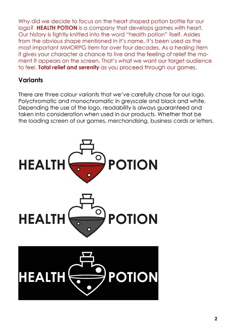
The 2022 logo puts the name either side of a heart-shaped potion flask, on one baseline, with the flask as the heart of the name.
In 2024 I let the name do the work: HEALTH over POTION, with a full stop.
03 The system
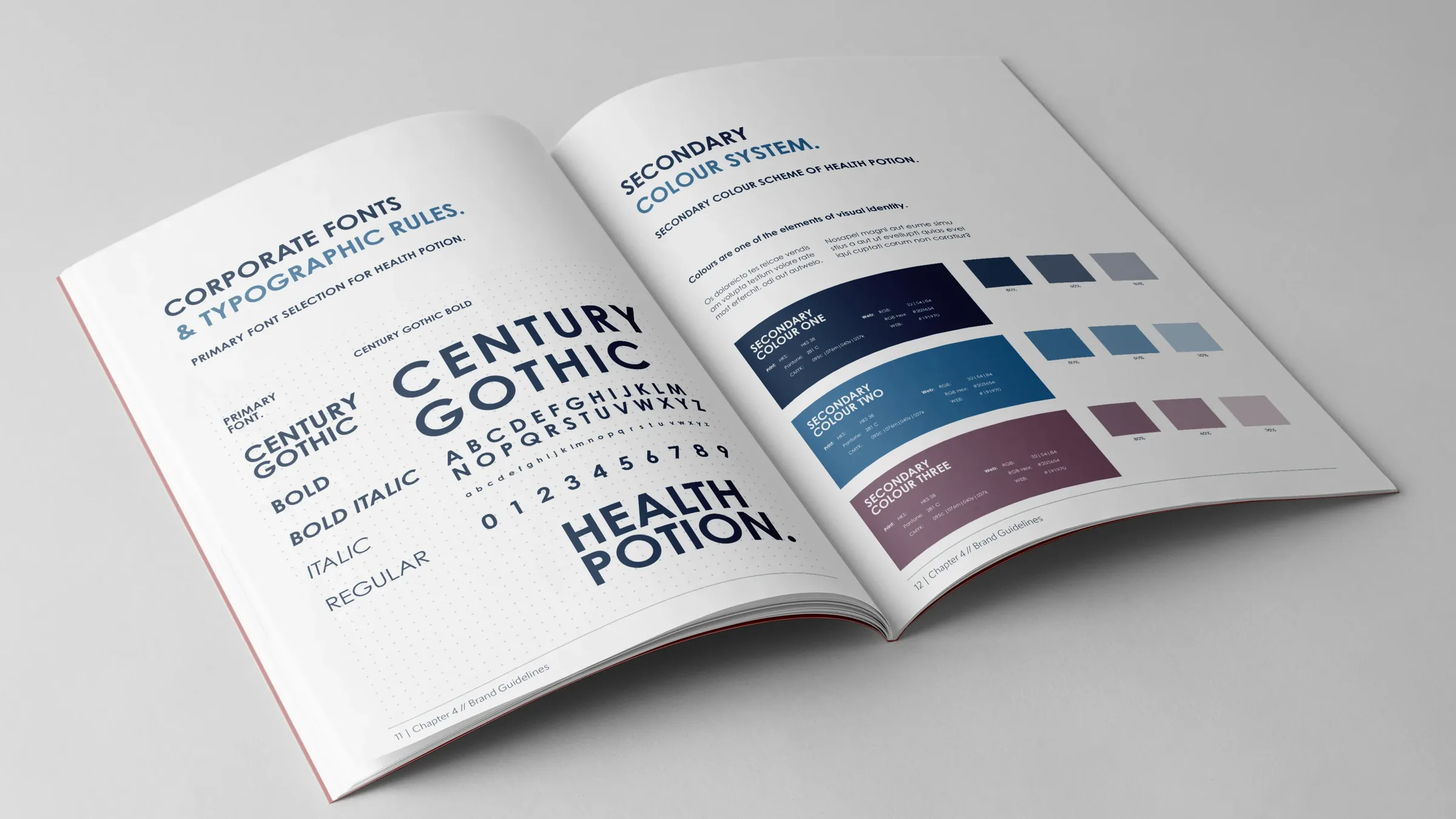
The type is Century Gothic Bold, used from bold down to regular. Every colour is defined for print in HKS, Pantone and CMYK, and for screens in RGB and hex, so it looks the same everywhere.
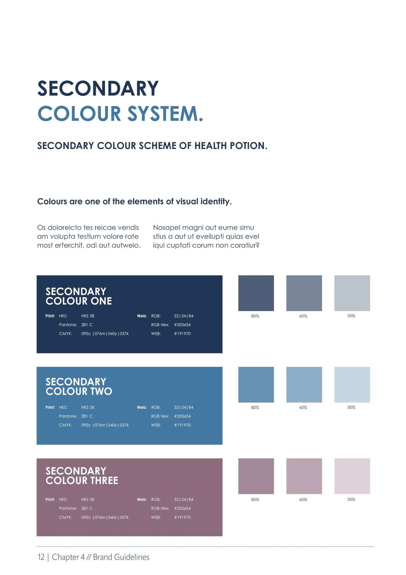
The 2024 colours are navy, blue and mauve, each with tints at 80, 60 and 30%, so the three always work together.
04 Two years later
In 2024 I put together a portfolio for my bachelor’s application, and looking at Health Potion again, I could see how much I’d grown since. I get that with old work: two months into my internship I felt the same about my old portfolio, and about ReStock. To me that’s a good sign, and I always push my work to look better. So I redesigned Health Potion to see how much better I could make it.
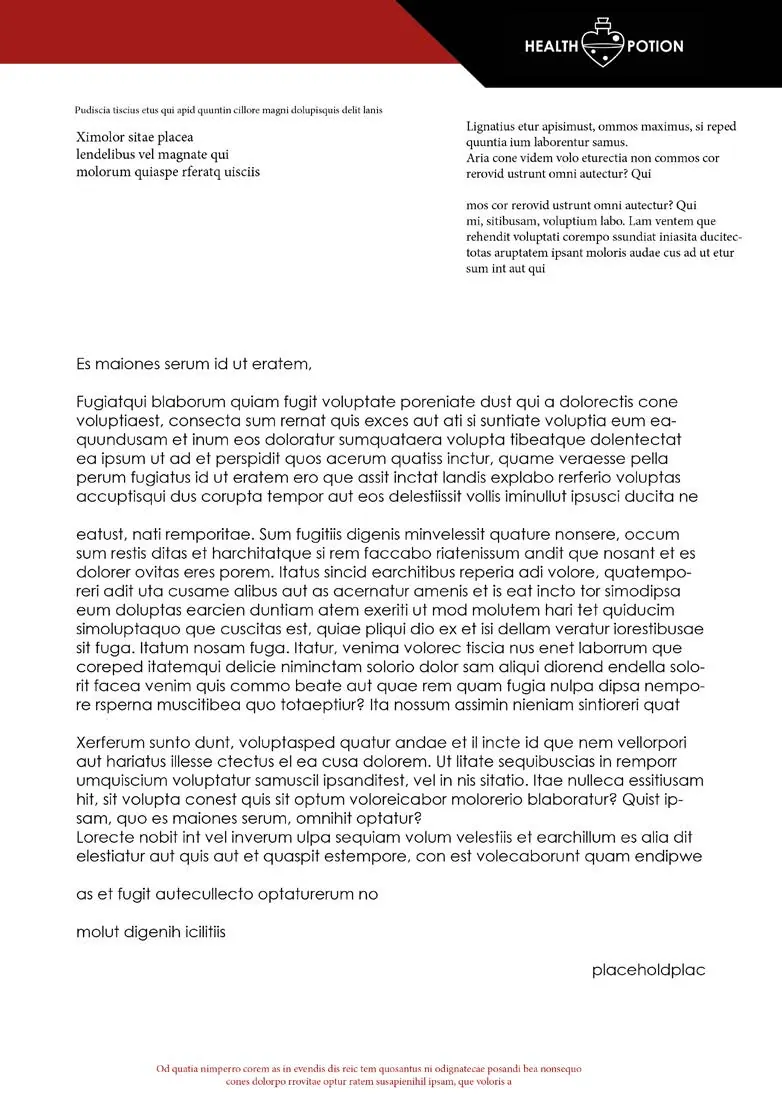
The 2024 version is tighter: a colour system instead of a single red, a clearer hierarchy on every page, and the same layout and footer throughout.
The covers of both versions used game art that isn’t mine, so they’re not shown here.