Something Wicked
A logo from 2024 that grew into this website.
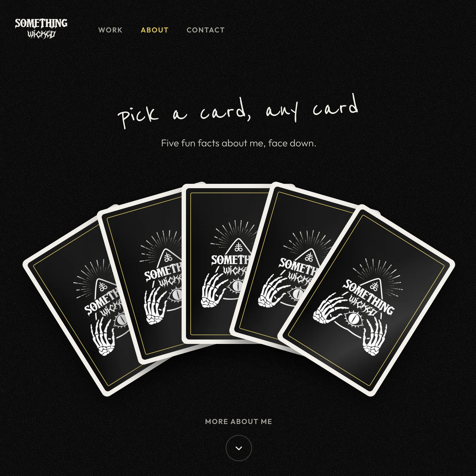
Something Wicked is the name I've worked under since 2021, but it had no identity until 2024, when I designed the logo. In 2026 I rebuilt my portfolio around it, after feedback that the old site looked like an agency.
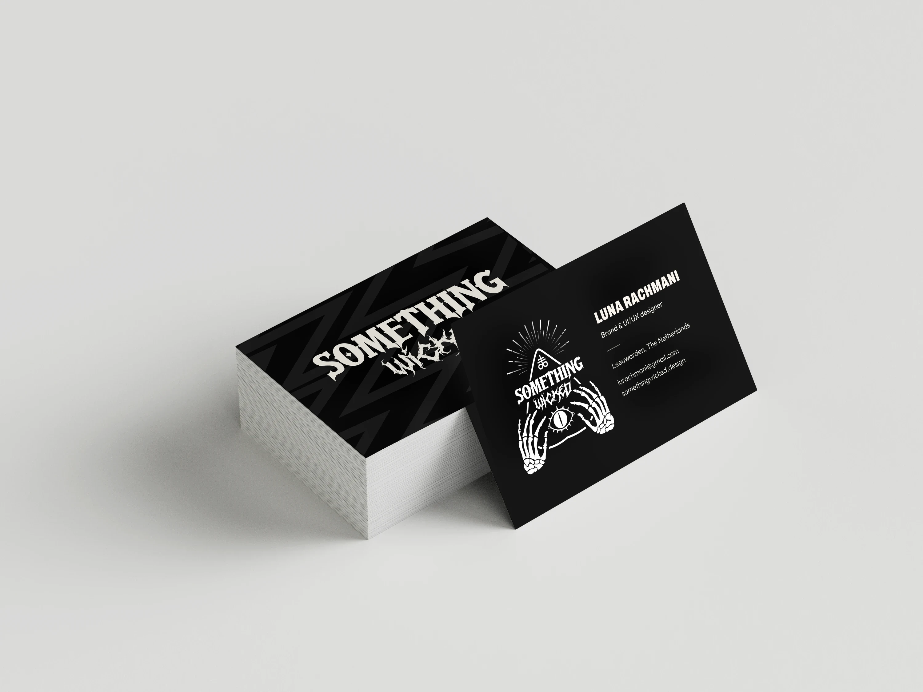
This is how one mark became a system: three logo sizes, two pairs of fonts, one loud colour, and the patterns I borrowed from other studios and made my own.
- My role
- Concept, logo, identity, UI/UX design
- Team
- Just me
- Discipline
- Brand identity & UI/UX
- Year
- 2024-2026
01 The mark
The logo is built around a planchette, the pointer from a talking board. To me it stands for the mix of mystery and purpose in my work.
Skeleton hands frame an eye in the middle, so the symbol still reads when it's small. When I vectorised it in Illustrator, I kept the embellishments on top of the planchette: they give it character.
The wicked part: Wicked means brilliant, not dark.
02 One mark, three sizes
The full illustration is too detailed for a header or a browser tab, so the logo drops a level at a time. L1, the illustration, is for big moments like the About cards. L2, the wordmark, sits in the header. L3, SW, takes over on phones and as the favicon.
I set SW in Quinthero, the font of 'SOMETHING', so even at 16px it still belongs to the wordmark.
03 The site as the identity
Feedback on my old portfolio was that it looked like an agency. But nobody visits my site to hire an agency; they're looking for me as a designer, and I was missing from it. So the new site is clearly mine: first person, my photo, handwritten notes, torn paper and caution tape.
It's loud at the top and calm where the work is. Quinthero and Heartless only appear in the logo and the hero; Archivo and Outfit do everything else. Yellow is an accent, not a fill, and each project brings its own colour to its case study.
04 Borrowed, then made mine
Strong visual elements are a shared language across digital agencies. I studied Koto, Framna and G2K, took specific patterns rather than looks, and gave each one a twist of my own.
Looking closely at studios I like taught me where the line is: borrow how something works, never how it looks, and then commit to my own accent.