Editorial Design & Logo
An editorial design project combining a newspaper layout with an original logo, built around the story of Teleholding, the Skene brothers, and how the Dutch 06 phone lines changed the Netherlands forever.
01 Context & concept
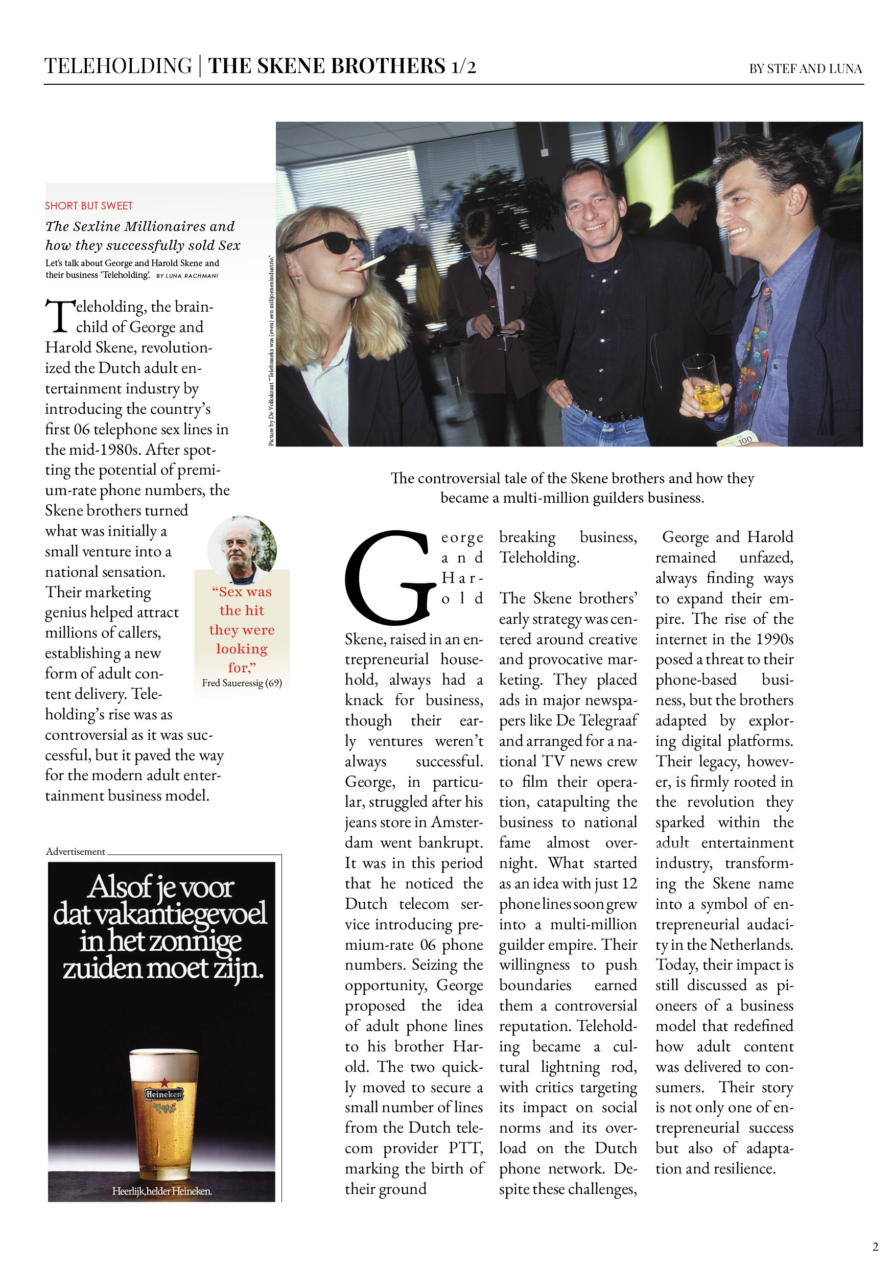
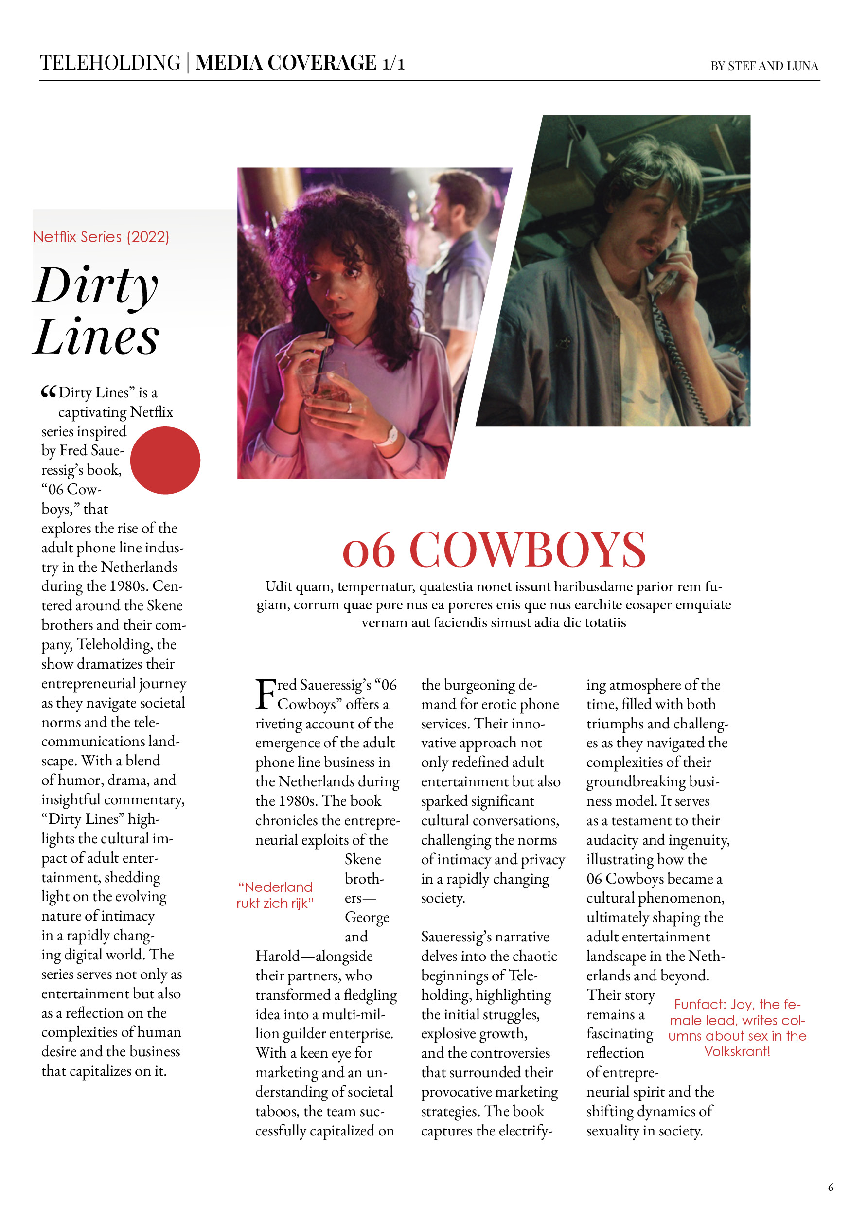
I proposed the topic after watching the Netflix series Dirty Lines - a show based on Fred Saueressig's book "06 Cowboys" about the Skene brothers, who pioneered Europe's first phone-based adult entertainment services in the Netherlands in the mid-1980s. The story had everything: entrepreneurial audacity, cultural controversy, a submarine fire, and a lasting impact on Dutch telecommunications law.
The team agreed it struck the right balance between historical depth and design challenge - building an editorial experience with a retro aesthetic around a topic most people had never heard of.
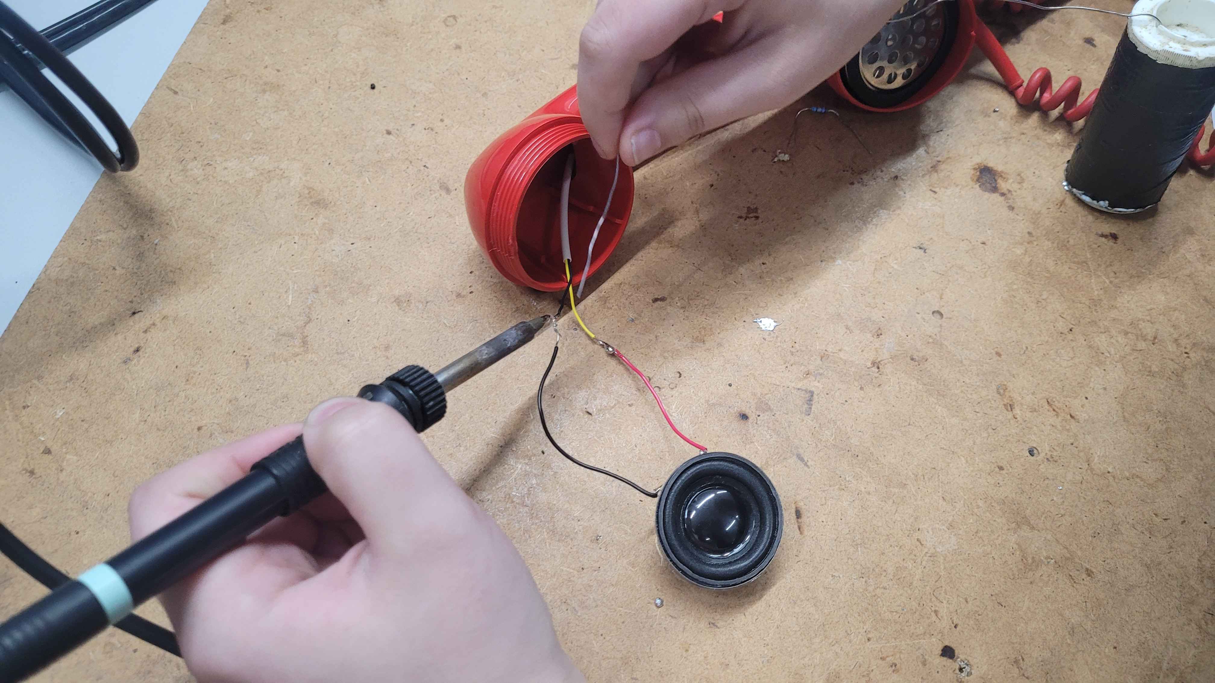
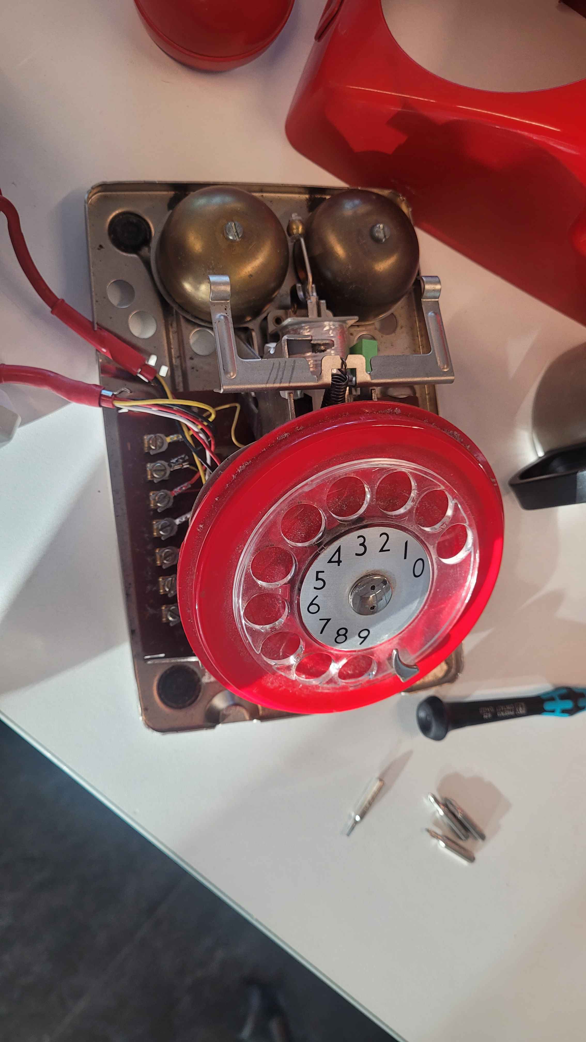
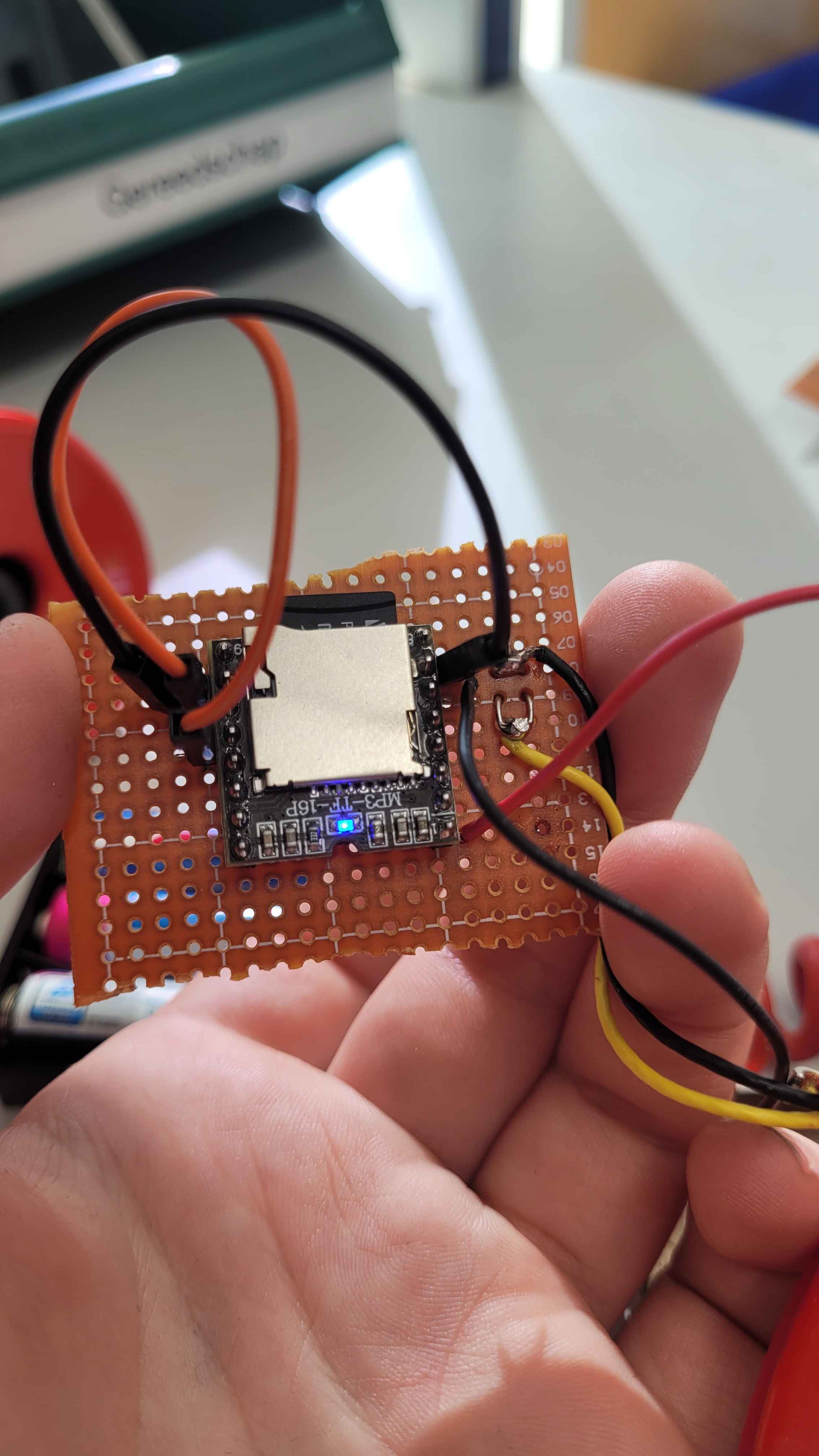
The four-week NHL Stenden brief asked us to design an interactive educational experience. I led on concept development, proposed and engineered the functioning telephone prototype, edited the newspaper layout inspired by De Telegraaf, and designed the TLDR flyer and timeline infographic.
The colour palette - Night Black, Anti-Flash White, and Fire Engine Red - was chosen to reflect the provocative nature of the 06 lines. Playfair Display and EB Garamond were selected for readability and historical resonance.
02 Process & pivot
The original concept was a Science Fair board - divided into an introduction, a timeline, and a breakdown of the 06 phone lines. After a feedback session with our mentor Rik, it became clear the board lacked engagement. We pivoted to a combination of a poster, a functioning telephone, and a newspaper - a more immersive and interactive approach.
I engineered the telephone to play audio clips mimicking the real 06 lines, making the experience tactile and era-appropriate. The poster was simplified to a silhouette of a woman consistent with the late 80s theme.
At a community feedback session, it became clear that the newspaper format - while visually strong - was too much content for an exhibition environment. We responded by designing a compact TLDR flyer that compressed the key information into a clear timeline from 1986 to 2002.
The flyer used period-appropriate 90s-style advertisements to keep it authentic to the era, and a red phone icon in place of a standard graphic. At the final pop-up stand on October 22nd, over 20 students from the target demographic confirmed the telephone and poster were the most effective pieces - the interactivity and retro aesthetic were what landed.
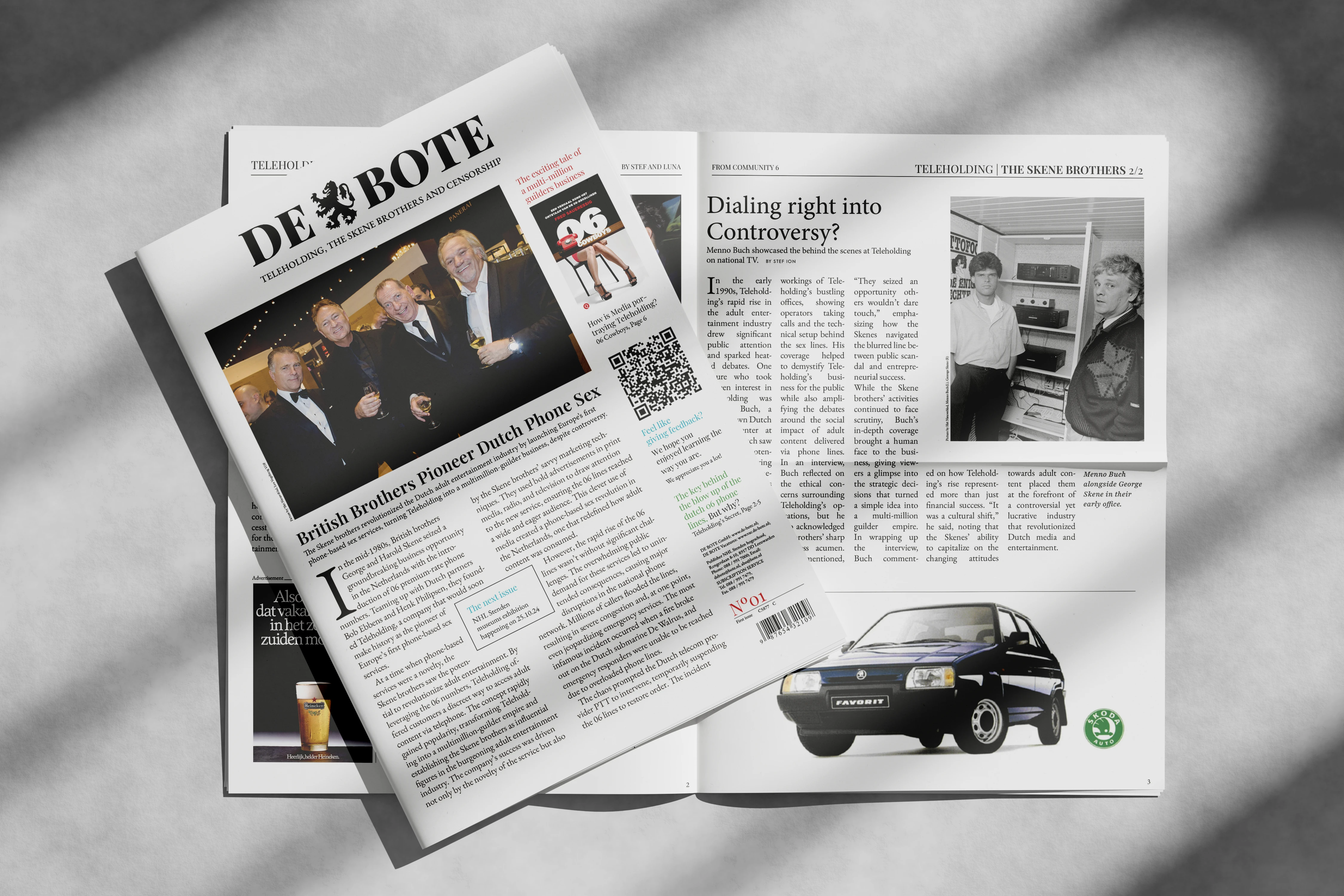
03 The newspaper
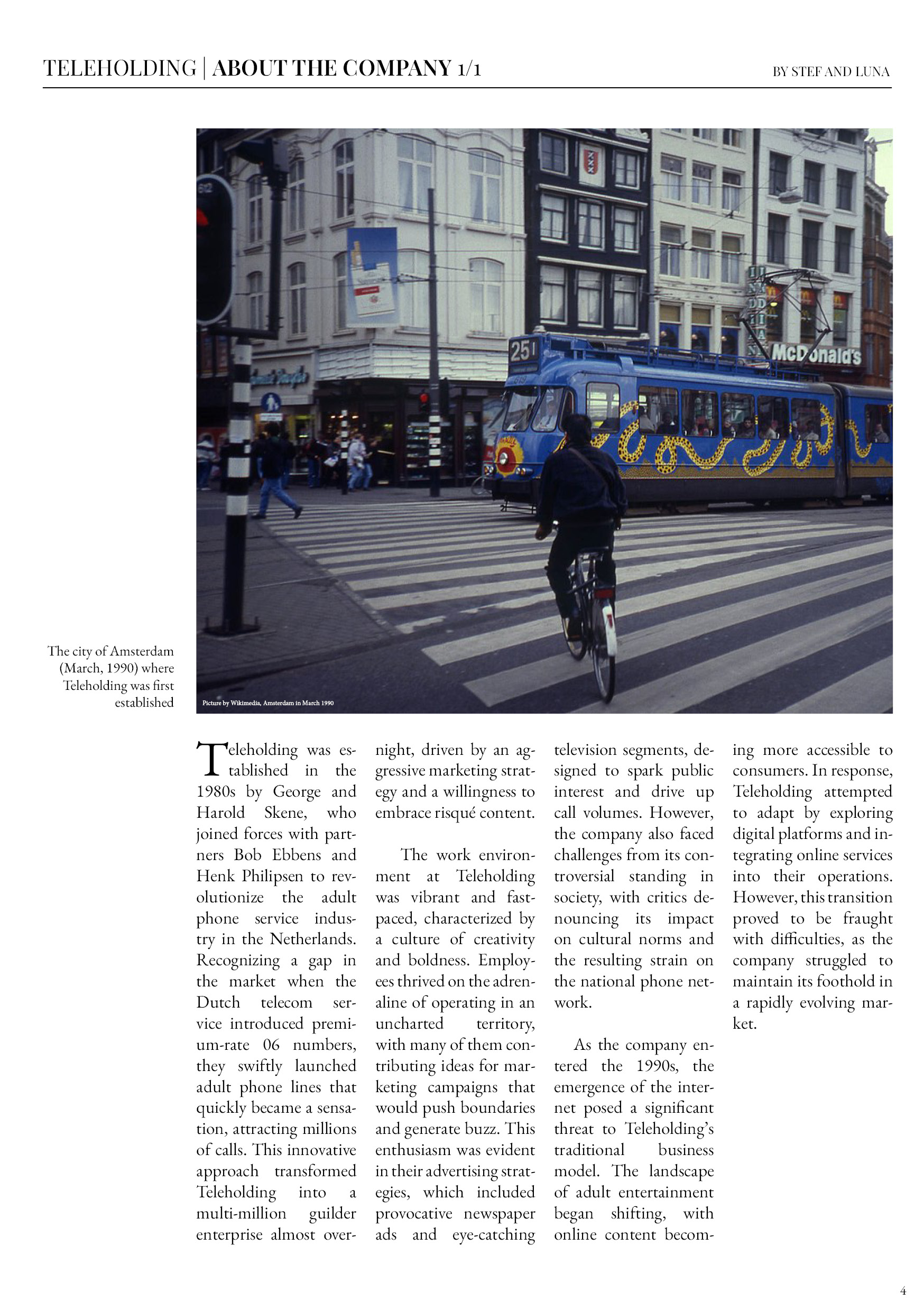
The logo needed to sit on top of a busy newspaper layout without getting lost - bold enough to read over content but still feeling like it belonged to the publication. I used Leeuwarden's coat of arms as the anchor, vectorising the lion in Illustrator for clean scaling at any size.
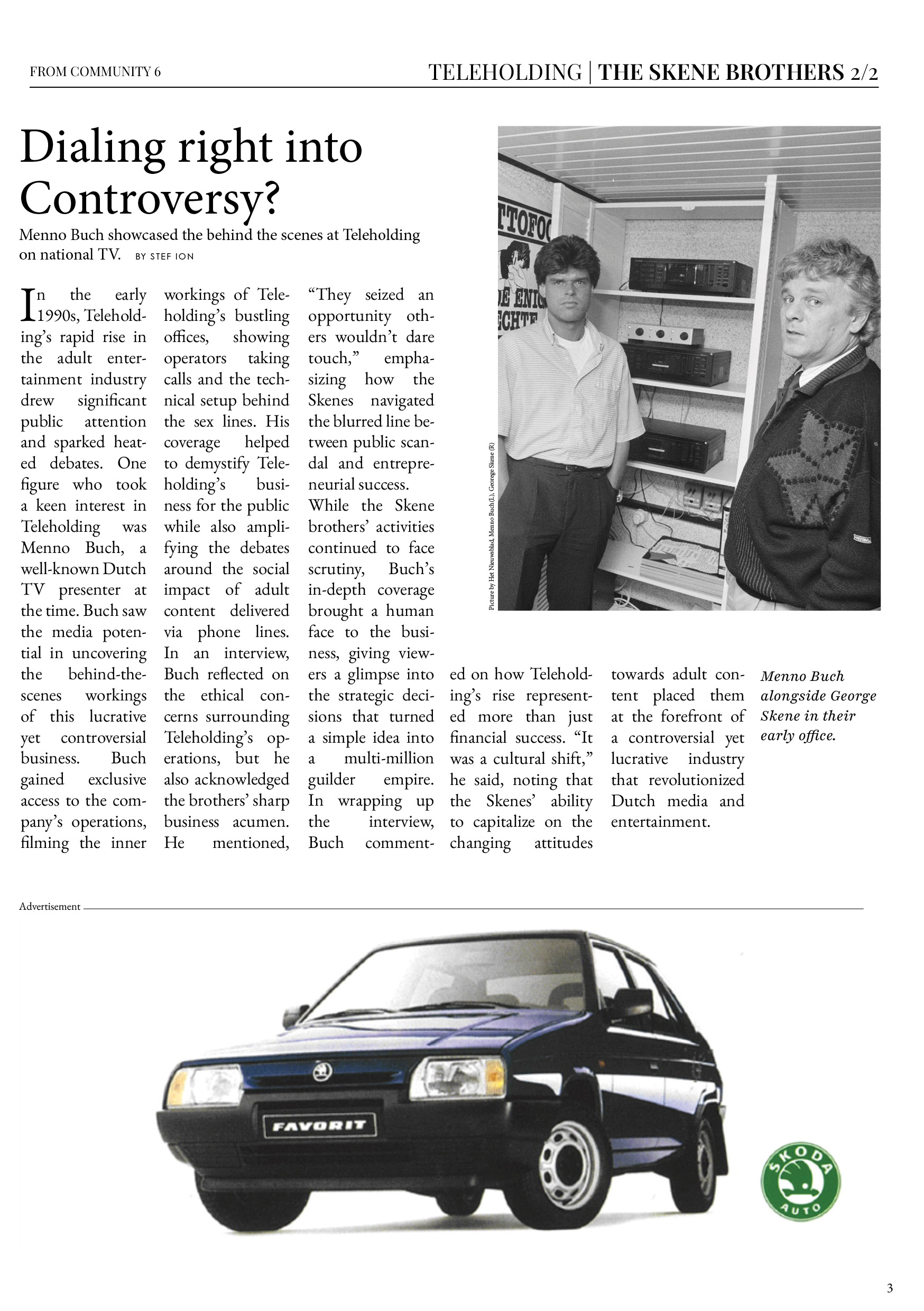
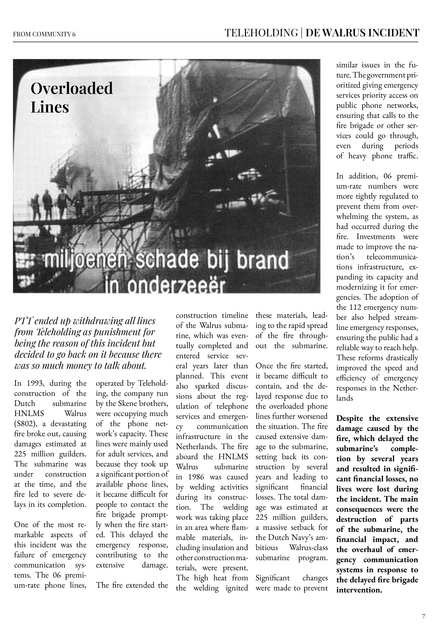
The newspaper covers the full Teleholding arc: the Skene brothers' rise, the De Walrus submarine fire caused by overloaded 06 lines, PTT's intervention, Menno Buch's TV coverage, and the eventual legislative fallout that reshaped Dutch telecommunications law.
The 06 lines weren't just a business story - they're the reason the Netherlands has the telecommunications laws it does today, why emergency services got a complete overhaul, and a marker in how openly Dutch society began to engage with sexuality. That context made the editorial work feel like it had something real to say.
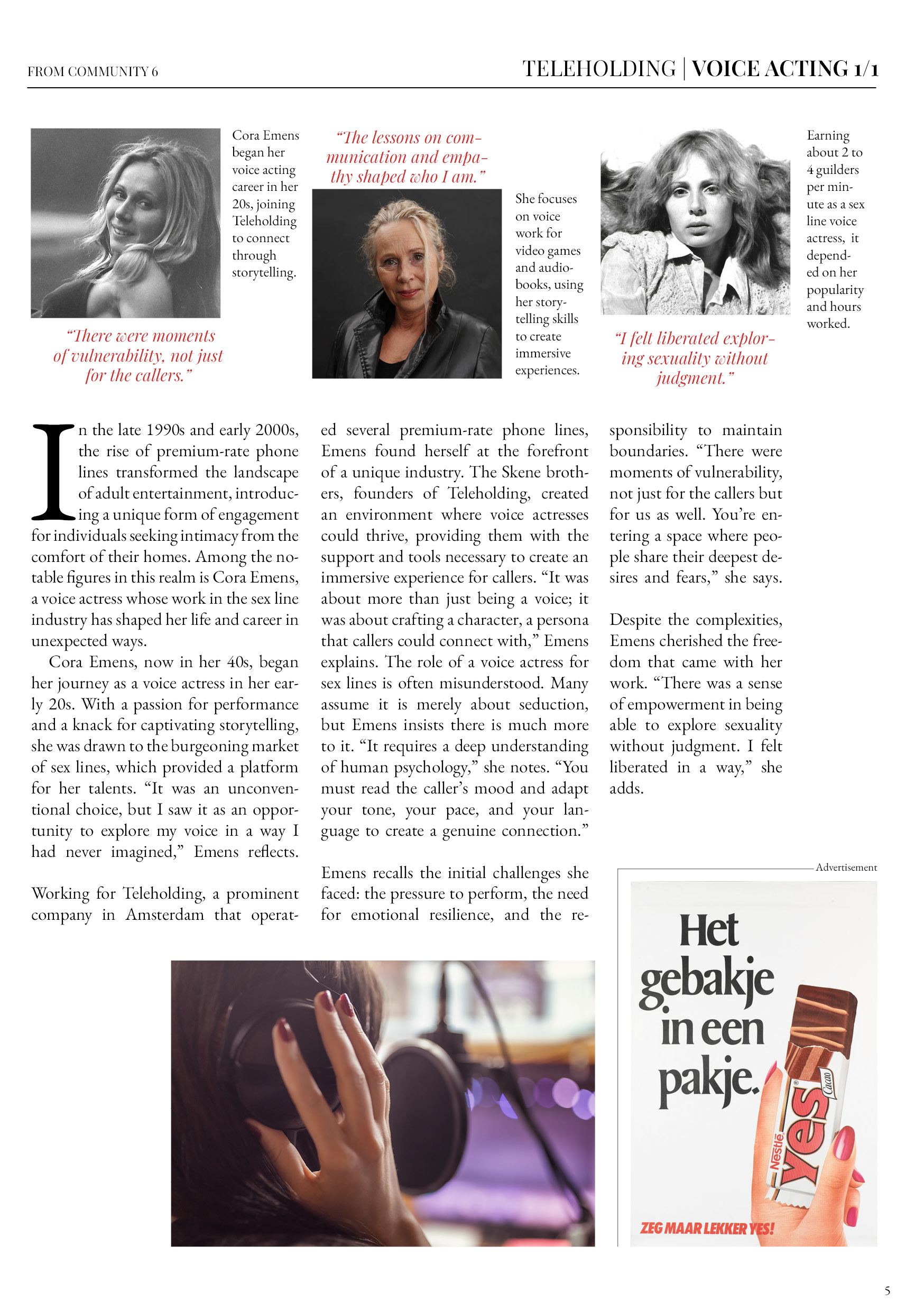
The newspaper ran to seven pages plus a TLDR insert, covering the Skene brothers, Cora Emens (a voice actress for the lines), Menno Buch's documentary coverage, the De Walrus incident, and media representation through the Netflix series.
04 Outcome & reflection
The project was an exercise in iterative working. Moving from a Science Fair board to a telephone, poster, and newspaper - and then adding the TLDR flyer - was driven entirely by feedback at each stage. Every pivot made the end product stronger.
Survey results from the pop-up confirmed the telephone was the standout piece. The interactivity did what static editorial couldn't: it put people inside the experience rather than in front of it. The newspaper added depth for those who wanted it; the flyer handled everyone else.
Reflection
Designing around a topic this specific taught me that strong editorial work isn't about fitting content into a template - it's about finding the format that fits the content. The telephone wasn't in the brief. It came from asking what would actually make someone want to engage with this story.