Poster Design, Mascot & Brand Identity
Multi-year work for Kokoro, a music label whose name comes from the Japanese kanji for 'heart'. Projects included a logo, festival posters, and a full redesign of the label's mascot Koko, one of my favourite long-term creative collaborations.
Work & approach
Kokoro is a label built around artists from every genre making music from the heart - hence the Japanese kanji for 'heart' as both name and visual anchor. Over multiple years of collaboration I worked across the full brand: logo design, event posters, and illustration.
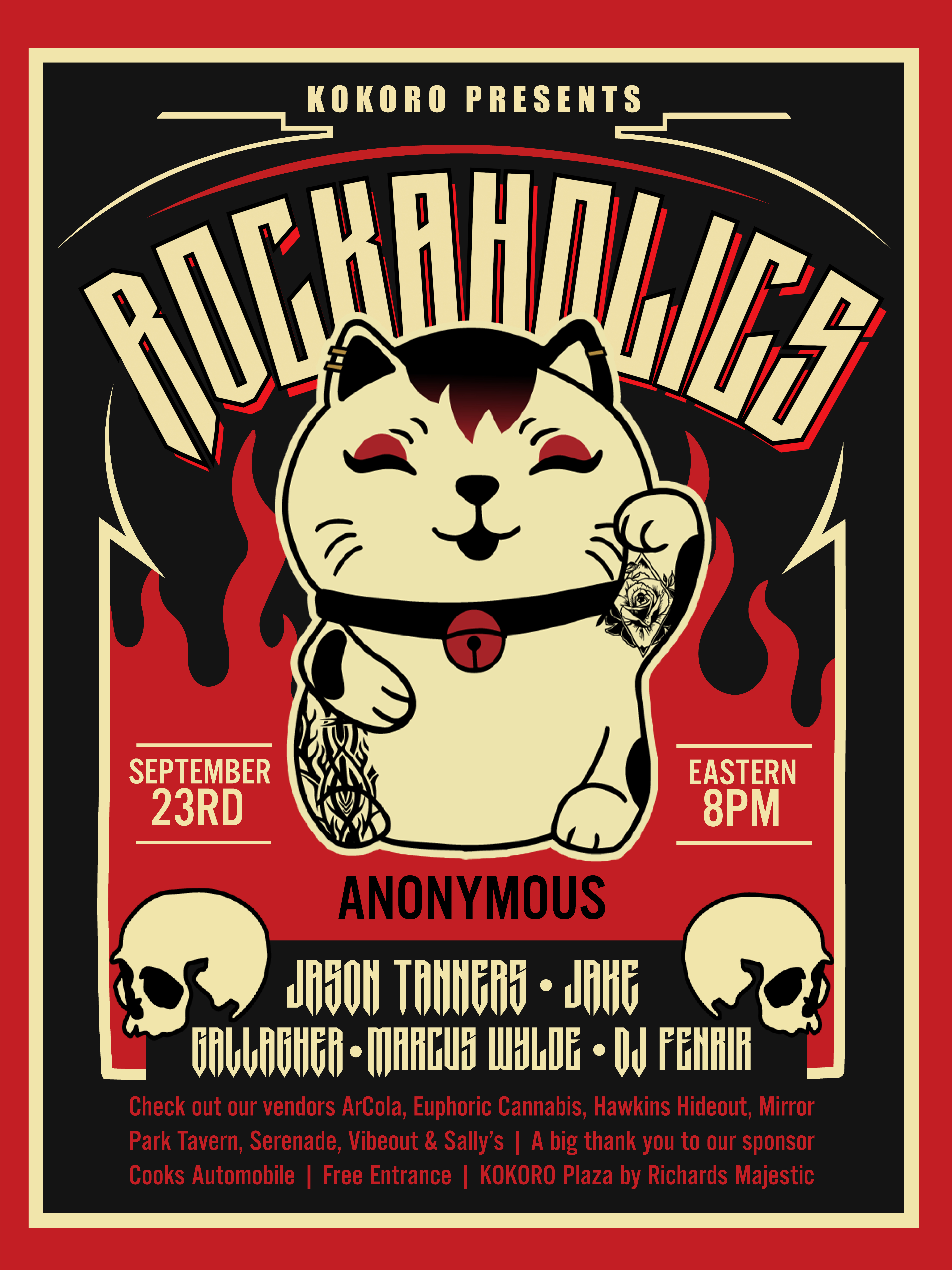
The Rockaholics festival poster is a highlight from this period. Designing for a rock event meant working with high-contrast, bold typography and a dark, flame-lit palette - a deliberate departure from the warmer Kokoro brand baseline to suit the specific event.
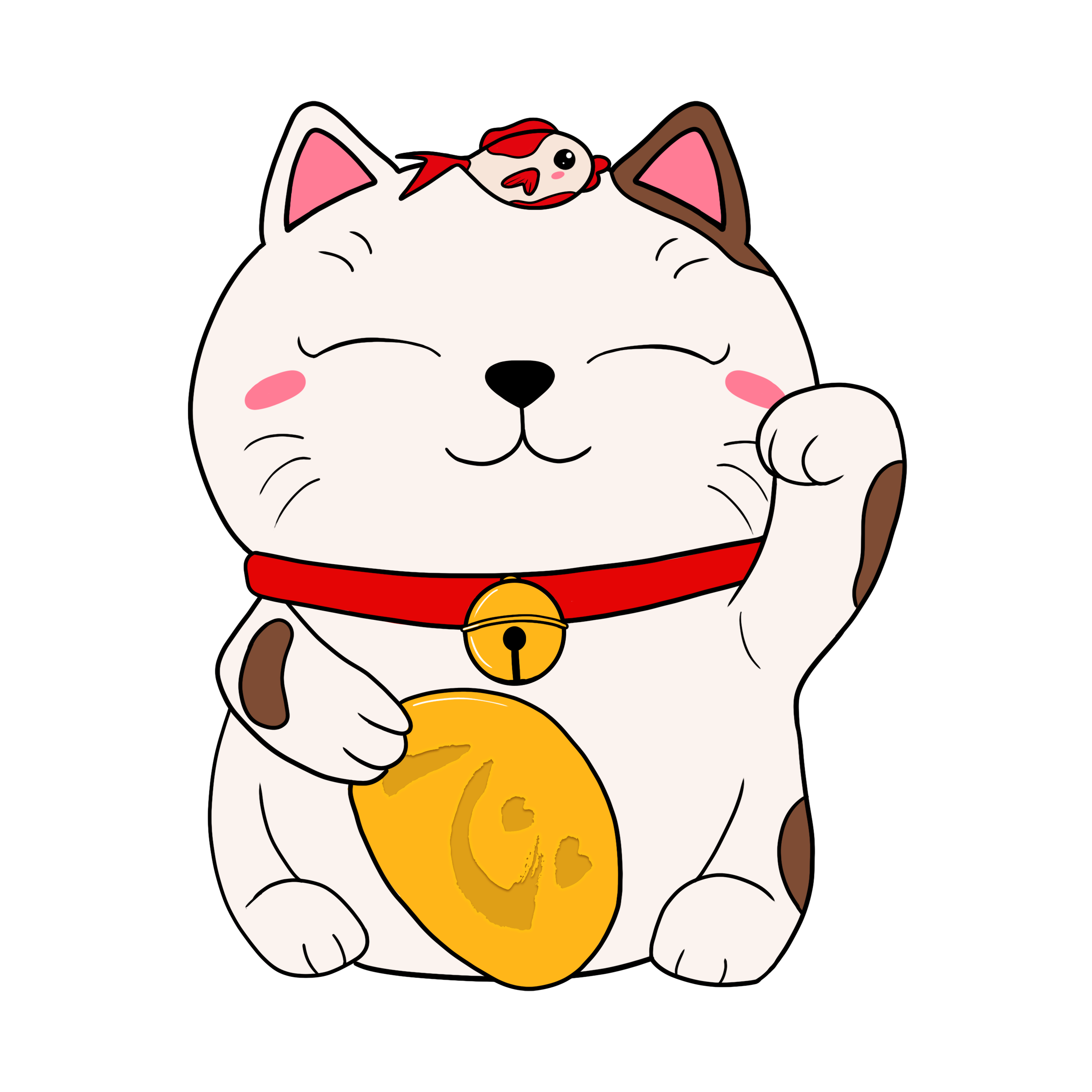
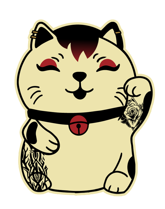
The mascot redesign was one of the more demanding illustration briefs - Koko is a maneki-neko (lucky cat) who needed to feel both recognisable to the original and meaningfully updated. The redesigned version adds tattoo detail, a collar, and adjusted proportions that give Koko more personality without losing the warmth of the original.
Working with a client over multiple years on a brand that evolves is a different discipline from one-off design work. It requires maintaining consistency while still making space for the identity to grow.